Scenic Design- 2017- Loessin Playhouse- East Carolina University
The true challenge of the designing a stage adaption of Young Frankenstein is this: how do you create a visually striking and enjoyable show in the shadow of the source material? Mel Brook’s racy 1970’s comedy, itself an homage to the Frankenstein movies of the 30’s, is so iconic that designing a stage production based on it is a fairly daunting order.
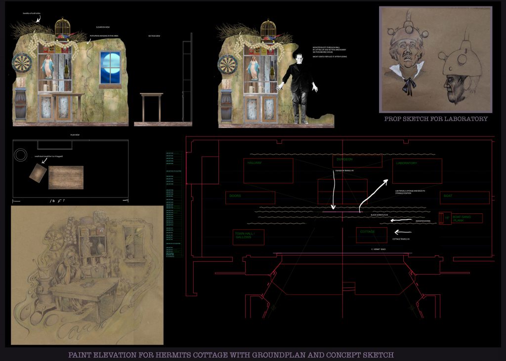
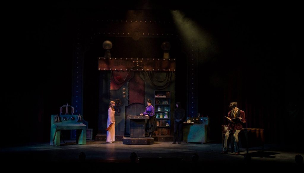
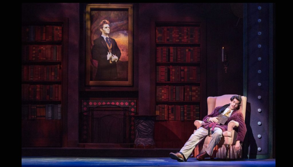
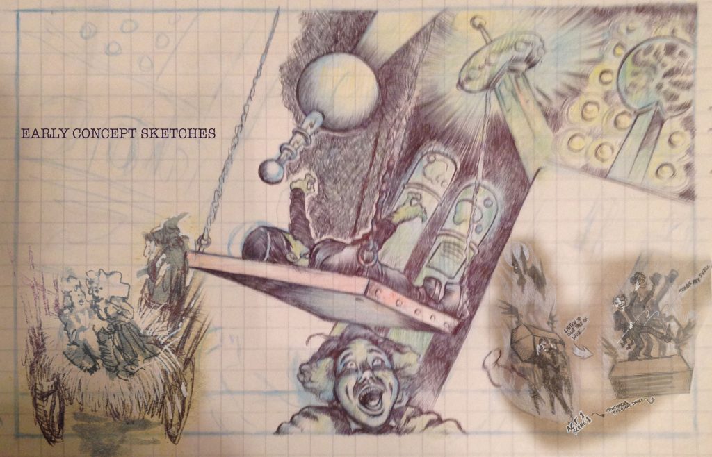
My initial approach was to map out some of the scenes in a drawing, focusing on the mood I was looking to achieve. In doing so, I paid homage stylistically to the movie poster art of 1960’s “screwball” comedies such It’s A Mad, Mad, Mad, Mad World and What’s New Pussycat. During this process I was able to develop how I wanted some of the set pieces to look and function.
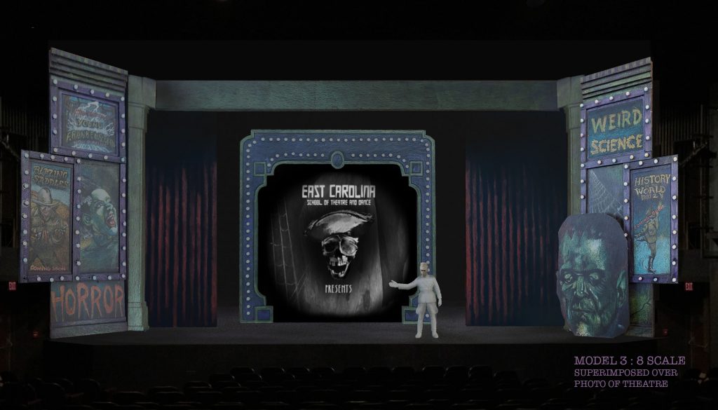
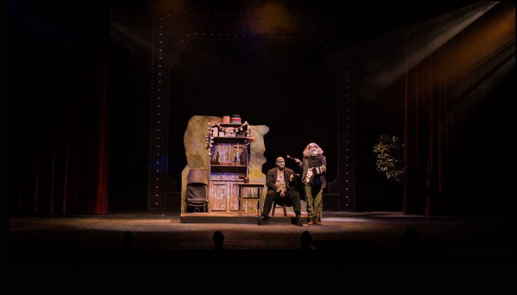
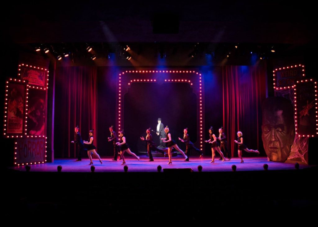
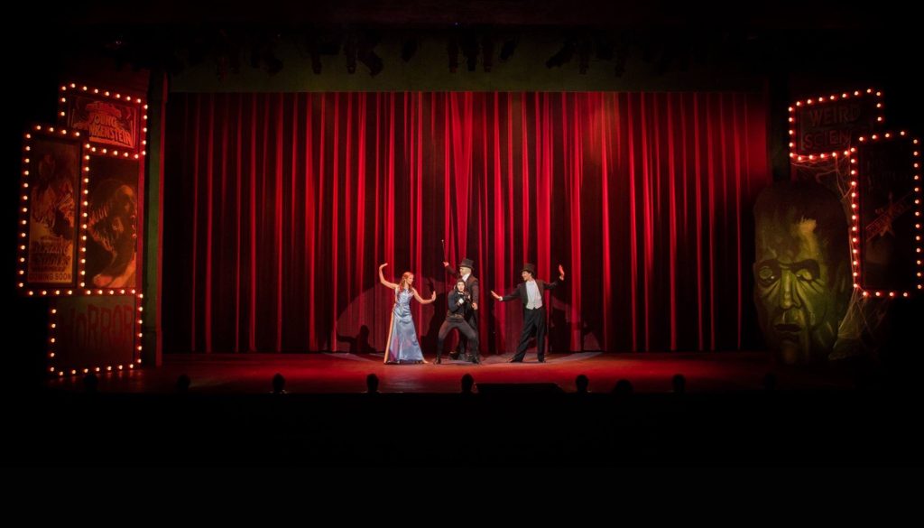
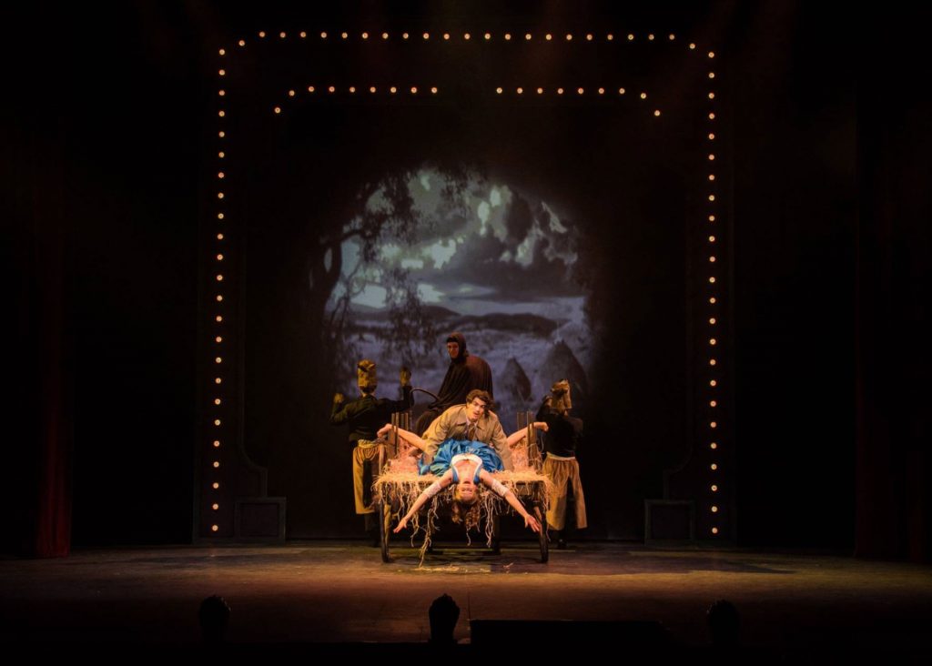
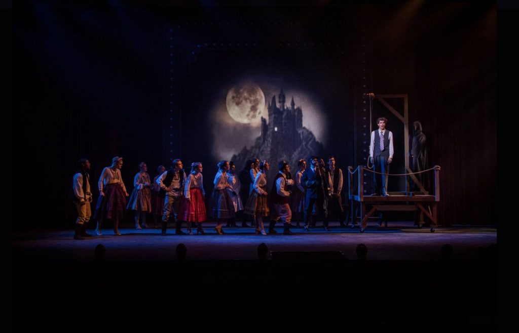
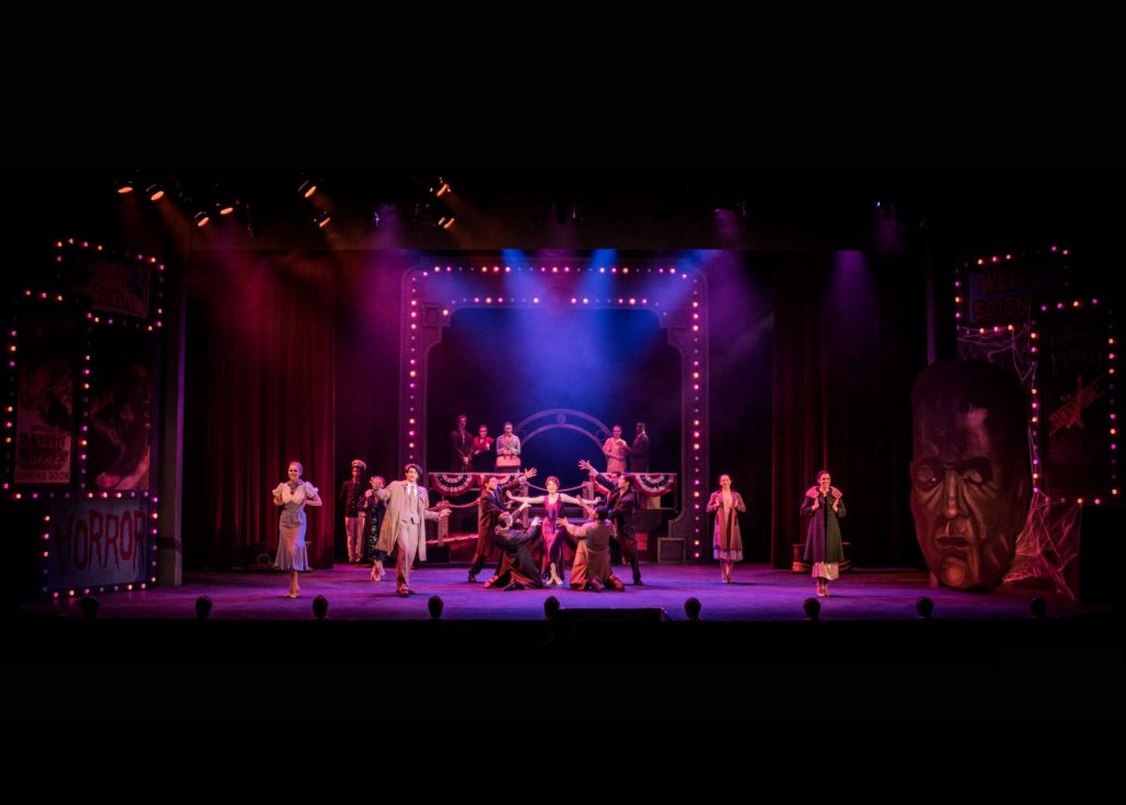
I then looked for inspiration in the old movie houses of the 1930’s and was able to find several reference photos of movie house advertising for a variety films. Unlike modern cinema which tends to advertise solely through the use of posters on the exterior of the theatre, I was delighted to find that movie houses of the 1930’s often went over the top with exterior displays in an effort to attract moviegoers. This became my inspiration for the proscenium. The addition of a flying movie screen at center stage completed this look. In keeping with this theme, all of the set pieces including the proscenium were vividly painted while anything projected onto the movie screen was in black and white and purposely manipulated to resemble an old movie reel.
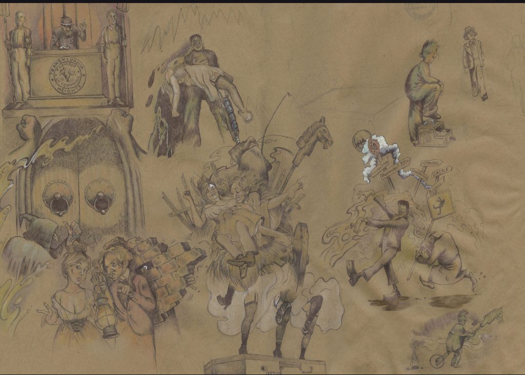 concept sketch 18″x24″